10 Great Infographics About Facebook

Posted by Aamir khan


In this modern age there are those who think that reading is passe and that people have become uninterested; nothing could be farther from the truth. What is really happening is that much of the information that we seek is online where reading can be difficult.
It has been proven that reading on the Internet is usually tedious and that most people do not really "read" when online; what they are doing instead of skimming, looking for pertinent information.
Add to this is the fact that we are in an information age and are constantly being bombarded with an overload of info on every possible subject.
Fortunately, there is now a great way to gain information on the web, that is quick but still meaningful, called inforgraphics. This is the definition of graphic designs that are meant to help increase the absorption of information on the Internet; it is a combination of visuals and important data that helps us understand statistics and information almost instantly.
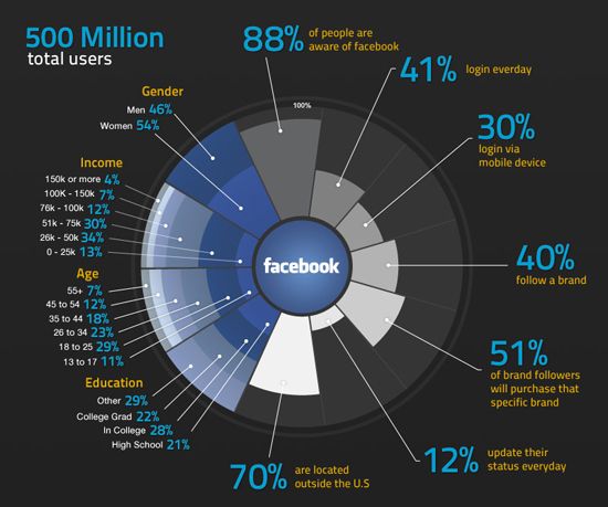
When infographics combine with social networking, the amount of information that can be digested and absorbed is incredible. Some interesting infographics, which show data from the huge social networking of Facebook, include:

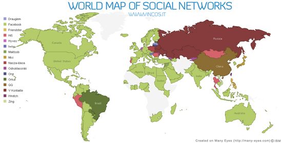
1. World Map of Social Networks

World Map of Social Networks
This world map is a fascinating source of instant information on how vast social networking has actually become, especially Facebook.

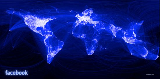
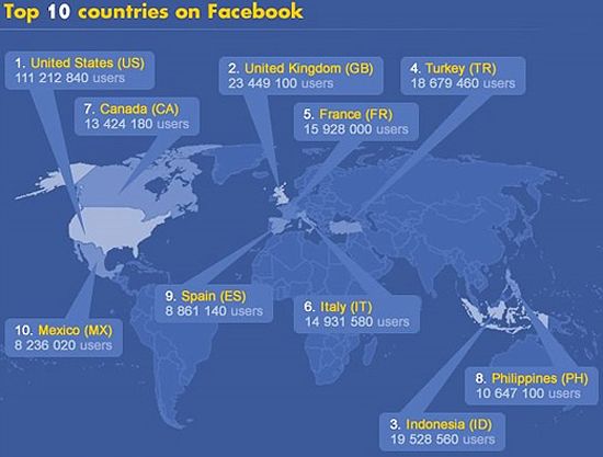
2. The World According to Facebook

The World According to Facebook
This is a Friendship Map created by a Facebook intern, with surprising visuals. By connecting the 500 million users, the world suddenly appeared, continents and all.

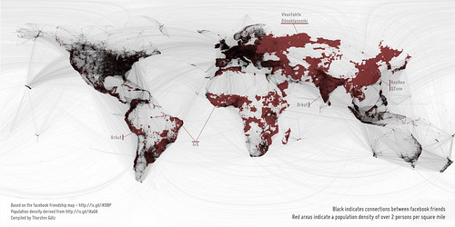
3. Filling in the Black Holes of the Facebook Friendship Map

facebook vs. the rest of the world
This looks at the areas of the Facebook Friendship Map to study the areas that have not been significantly reached, usually because of lack of technology.

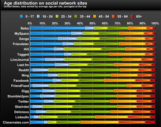
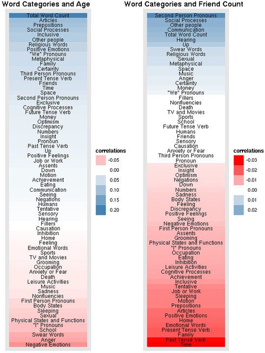
4. Age Distribution on Social Network Sites

Age Distribution on Social Network Sites
An easy readable site that shows the different age groups and what social networks attract what ages. The amazing thing about Facebook is that it has a strong and very even cross section of members from children to retirees.

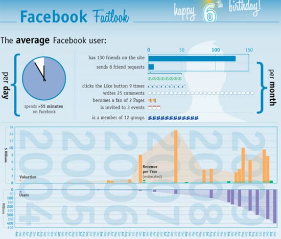
5. Visualizing 6 Years of Facebook

Visualizing 6 Years of Facebook
This infographic is a celebration of the six years of Facebook's existence. Fans can see the growth and spin-offs that have come about because of this popular social networking site.

6. Facebook: Facts & Figures For 2010

A very interesting infographic that shows the average stats for users during 2010.

7. The Boom of Social Sites

The Boom of Social Sites
Another very visual infograph that shows the growth of social networks since 1995. Facebook is the largest network on the graph.

8. Facebook Status Updates

Facebook Status Updates
This is an infographic compiled by the Facebook team that shows the differentways of social media is used across age groups.

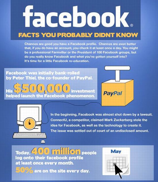
9. Facebook: Facts You Probably Didn't Know

Facebook: Facts You Probably Didn't Know
This little gem is an infographic on Facebook facts that most people are completely unaware of.

10. Facebook vs Twitter: By The Numbers

Facebook vs Twitter: By The Numbers
Via  Feedgrid

{ 0 comments... read them below or add one }

Post a Comment

What you Says

..-

Related Posts Plugin for WordPress, Blogger...

If you like this blog,then link back to me.
This is what you will see.


Optionally use this Widget installer to add this link to your blogger blog.